Thursday, 25 November 2010

Final Prints!!!!!!!!!!


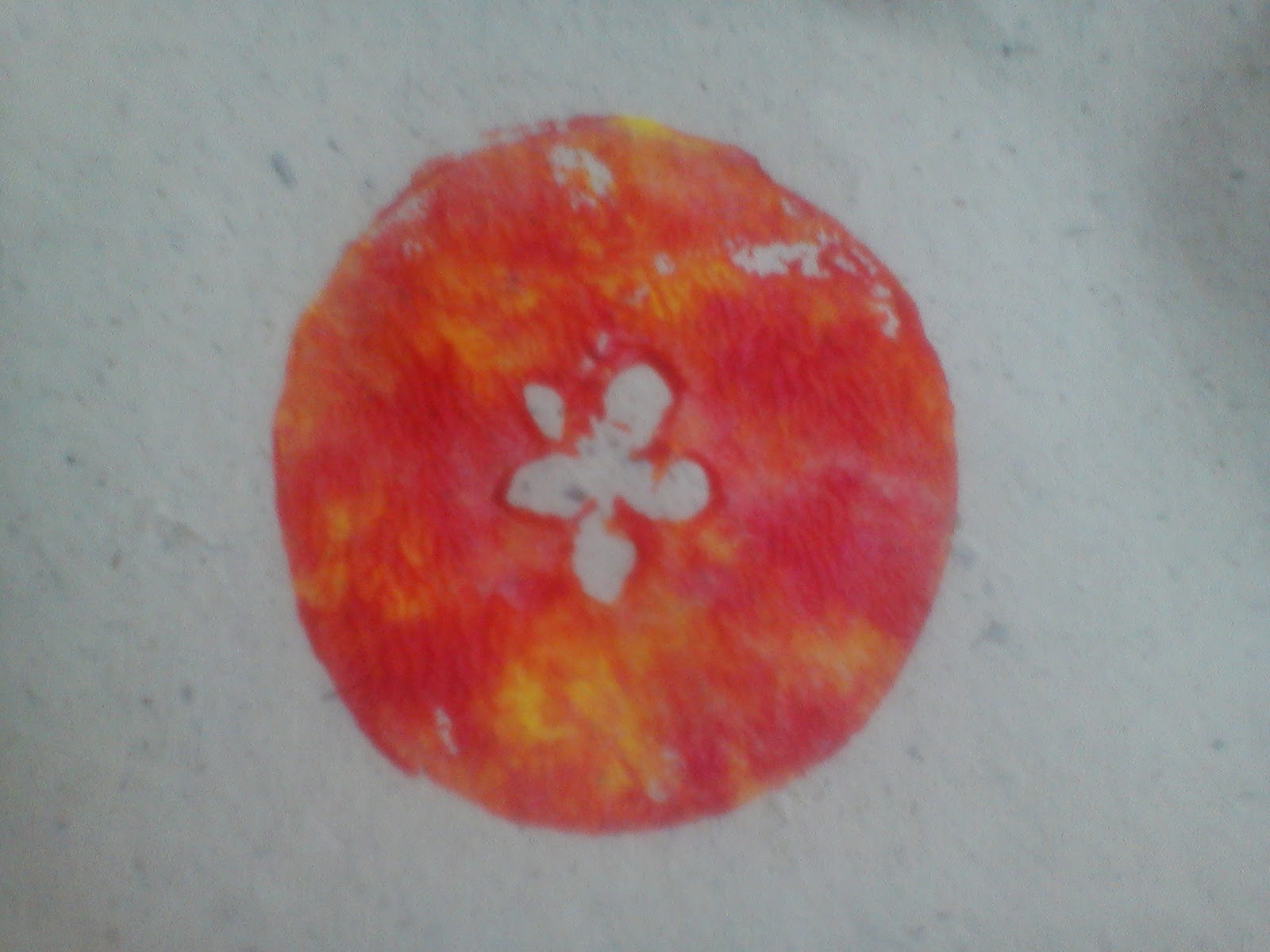
Woohoo.  Finally got the printing done.  After using up 3 out of 4 of my handmade paper sheets and it going wrong I wasnt very hopeful about the final one working BUT IT DID!!!! And I am very happy.  Pity the paint colour wasnt what I would have liked and the handmade paper was one of the sheets that I wasnt too keen on but still I have my print and it worked.


I tried to make the background look a bit more textured by scattering talc.  


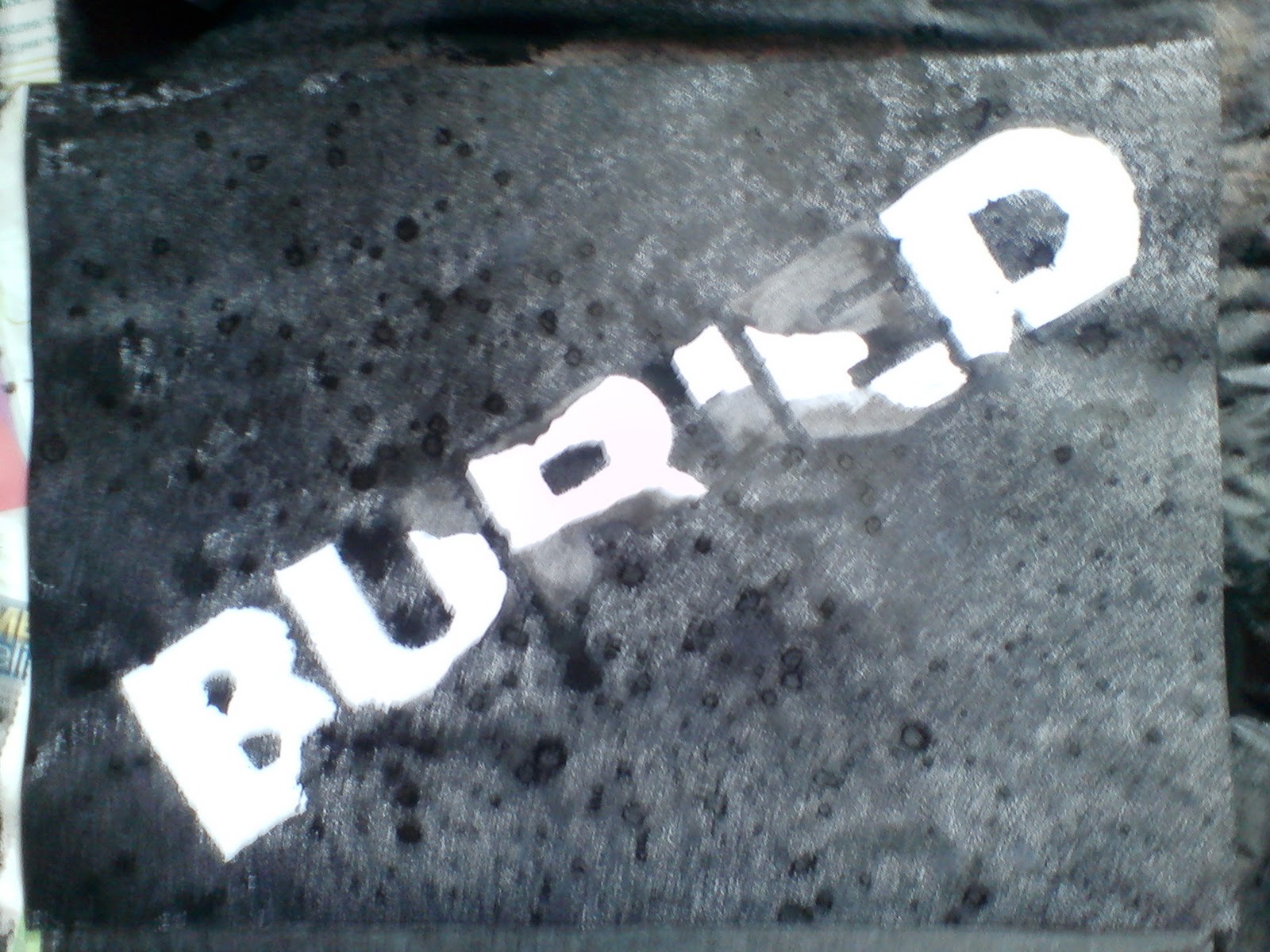
I even tried printing on to a tshirt material just for the hell of it.  

Sunday, 21 November 2010

5?


Packet 1


Packet 2


Packet 3


Packet 4


Packet 5


Preparing to melt them :)


In the oven :)


Burnt :(
Jelly Tots melted in a tray.  Unfortunately instead of melting together, they just burned =/ hmmmmm


The 5 pointed shape in an apple cross section.


Apple print on handmade paper


Apple print on kitchen roll


5 point turn vector


5 point turn using a toy tractor in ink


...and again


Wednesday, 17 November 2010

Screen Printing!!!!


Process of screen printing that we did today.  After painting our screens in light sensitive emulsion and letting them dry in a dark room, we took our acetates and put them onto the big light exposure box thing.  The screen is placed on top and the box machine is sealed.  The air is sucked out creating a vacuum and the machine is left to do its job.  When the screen is removed it needs to be washed off with water to remove some of the emulsion and reveal the art work.  Then its time to print!  Woo...

Monday, 1 November 2010

One Day Project

Business card!!!

Compliments slip


Business card

Compliments slip


Sunday, 24 October 2010

And throw in a bit of Picasso...

"Every child is an artist.  The challenge is to remain an artist after you grow up."  Pablo Picasso

Finished Buried Poster


Poster ready to be printed onto acetate.  I haven't decided exactly what material I want to print my design on to yet.  I liked the sandpaper but I cannot purchase any at the size I would need for an A3 poster.  So now I have to make a decision, hmm...


Saturday, 16 October 2010

A happy accident? Or just a regular mistake...

Coming to the end of my experiments as I cannot actually think of anything more to do for the time being.  Trying at the minute to come up with the word Buried in white on a black background but the word should be rough and distorted.  


This was my first attempt.  The ink started to flow too much though and partially covered some of the characters making the word not all that legible.  

Time to move onto something else then...

Friday, 15 October 2010

Screen Printing!!!! Awesome!


These are my very first attempts at screen printing.  
Above, I used a letter B stencil that I cut out and talc.  I was trying to see whether or not the talc would make the edges of the B look blurred/rough.  Don't think it quite turned out as I expected it to but it helped me to come to some decisions over my final piece and how I plan to execute it.


This piece involved more talc and some square hole punches.  I think its quite cool and (the top left) reminds me of a brain, so if I ever need such a texture, I now know how to achieve it.  I think my favourite texture has to be the smaller bits of talc on the right hand side.

It's been a while...

Mark Making Experimentation 


Our first uni project involved choosing an event and creating a poster that could be screen printed.  I chose the new film Buried as my subject as I thought I could play about alot with the word and produce some fun, experimental pieces.  I have been using Indian Ink to create some mixed media pieces.  


Above is white crayon and ink.  I love how the crayon doesn't leave the characters perfectly smooth and clear. The ink bleeds into the edges of the characters where the crayon hasn't perfectly marked the page.


This piece also uses white crayon and ink but the ink has been watered down.  This leaves a more subtle mark on the page.  I like how the crayon doesn't fully resist the ink and it half covers the characters.  It almost buries the word Buried into the background.  

Sunday, 4 April 2010

This is the final design for the Fur Free Alliance Design Against Fur competition.  I an really happy with how it has came out.  I think that it meets the brief as I believe it appeals to the younger female target audience and it gets the message across with out using graphic imagery.  I think there may be more chance of people looking at this and reading the type than they would if it was a dead rabbit or something.  If it was something so graphic I believe some people would just recoil and not look at it.  

Thursday, 1 April 2010

Papa Johns Advertising

This is a really clever idea.  This photo of a pizza delivery man is placed over the peephole of peoples doors and when they look through it looks as though there is actually someone there.  This got people talking about the product and increased sales for the company.  The ad, designed by Saatchi and Saatchi, won gold at he Cannes International Advertising Awards. This is a good example of guerrilla marketing.

Monday, 29 March 2010

Nikki Farquharson


I love mixed media and found these pieces rather appealing.  The use of vibrant colours and patterns make the work very eyecatching and intriguing.  The work uses marker pens, newspaper cuttings, photography and fineliners.  All of this work looks like it has been done by hand rather than produced on the computer.


Another piece of work by this designer is a book called 65 modern proverbs.  In this she modernises a proverb book to make it more appropriate to modern culture.  For example, 'Hell hath no fury like a woman on a diet' and 'The blog is mightier than the sword.'  The layout is very simple; an uppercase sans serif typeface is used on a plain white background.