Wednesday, 27 January 2010

Packaging Unit So Far

Packaging unit part 1- Topic bar


The idea behind this is that most older people have grown up eating Snickers and Topics are often seen as the smaller Snickers wanna-be rather than looking at it as a chocolate bar in itself.  So I thought that maybe by targeting the younger generation, they may grow up eating Topics and this could raise its popularity in the long term and as the younger generation ages, so can the packaging design to suit the contemporary trends of the times.  I think this packaging looks completely different to all of the other chocolate bars on the market and, therefore, would stand out really well on the shelves.  i have retained the original font to give the packaging some continuity.


The idea behind this second piece of packaging is targeting the female population.  I wanted to make some kind of luxury but modern packaging which would make the consumer want to buy and eat and would be appealing to all people not just those who are of a higher class.  For this I have created a sub-brand called Posh Nuts.  These sweets would contain the more expensive nut: Macadamia.  The circle-y shape across the packaging is repetition of the outline of a nut.  This is meant to show how many nuts are scattered throughout the chocolate bar or chocolate sweets- this reflects the Topics strapline of 'a hazelnut in every bite.'

Next I am going to try and maybe replace the oval on the chocolate bar to the same nut shape that is on the Posh Nuts packaging.


Packaging unit part 2- Quaker Oats


This brief asked for the produce to be aimed at women aged 25-35 and had to stand out on the shelves which are dominated by Muller.  I decided to use the idea of 'lifes little luxuries' as women tend to find luxurious things appealing and make them feel better about themselves.  I also decided that I must start by looking at everyday luxuries as, obviously, they dont want the product to be a one off for people, so I looked at packaging design for perfumes, makeup etc, things that are a luxury but people use in everyday life.  I liked the style of the french boudoir so i designed a set of 'Dainty Oats' quaker pots.

Almost Final Narc


This is the pieces of work that I presented today in our crits with ND and the Narc magazine people.  I am quite happy with how my pieces turned out expect for the typography on the cover of the blue paint and string one- this was mainly due to the very little time I had left after concentrating on fitting all of the type into the leaflet and spending more time on the zebra piece.  I think the zebra print piece turned out alot better than I expected.  When I was actually wearing the body paint, I was concerned that it looked too much like a childs dressy up party costume and didnt look very professional but once i took the photos into Photoshop and slightly edited the colours, cropped the image down to be more abstract and added the Narc logo on, it started to look better than I had thought.  I also love the blue on the black and white background, I think it stands out very well.
Due to lack of time, I didnt get a chance to perfect the Narc logo on the blue paint and string version and make it look more part of the actual artwork.  As much as I like this piece, I think I prefer the zebra print one as I think it is more striking and the photography is more interesting and it makes you try and work out what exactly it is.  I believe that both pieces suit my concept of all these bands and their music being unique and individual.

Thursday, 21 January 2010

"Jump on the Jig Wagon" - Peter Chadwick Industry Day


"I used to have hair" 
The day started with a presentation from Peter Chadwick, which gave a brief history of his work and career.  After graduating from university, Chadwick started working on artwork for music labels.  He started up a company called Zip Design in 1996 and he continued to expand it up until 2006 when he finally decided that he was more involved in the finances than the actual artwork.  He went on to work as an art director under the banner of ‘Popular.’  Here he often collaborates with a range of different illustrators and photographers to produce the artwork.  Chadwick claims a lot of the work he has done over his career has been related to the music industry and this was evident in his presentation.  He aims now to move away from this and experience a variety of new challenges. 


“An acid trip on a motorbike in the jungle” 
Peter Chadwick projects that I particularly liked

 ·      Hedkandi plane- after working with Hedkandi for 9 years and seeing it grow from infancy, Chadwick got to design the aeroplane graphics for the Hedkandi Monarch Airlines aeroplane.  Although he was only paid £500 per plane, Chadwick claims that it was a very exciting brief and sometimes you have to accept such a small sum of money as this type of job would be snapped up very quickly by another designer.


 ·      Harvey Nichols window displays- Chadwick finds window displays an interesting project due to the sheer scale of the space.  The Harvey Nichols window was particularly challenging, as there was only a small door at the back of the display to fit the artwork in.  He described the theme as “an acid trip on a motorbike.”  This project had a £25,000 budget.

·    Lo Fidelity Allstars- in this project, Chadwick was asked to produce the artwork for the Lo Fideilty Allstars albums.  The brief asked for Yorkshire to look ‘other worldly’ and alien-like.  Chadwick claims to have a big passion for photography and especially loves working with photographers.  The photography here was produced by using a long exposure and photographing different locations in Yorkshire at 1am.


Jump on the Jig Wagon
After a quick break the FDs and NDs were split up into groups and we were to work on a small group project.  We were asked to come up with a new music tv channel name, state the brand characteristics and think of a way to launch the new channel.  Our group met and we made a spider diagram of possible genres but decided that, rather than pick a genre that some people knew better than others, we would pick one that noone knew much about.  This made it fairer and it also gave us an idea of what it would be like to be actually working on a project you didnt like when in industry.  We all picked a research topic and, after lunch, we spent 20 mins researching our topic.  Next we re-met and went through what we had found.  We started writing name ideas down and came up with Jig Wagon TV and the tag line 'Jump on the Jig Wagon'.  From then we made a spider diagram of our brand characteristics.  We decided our brand would be easy going/ laid back, fun, loud and out for a good time.  We then cut out all of our prints and assembled a mood board.

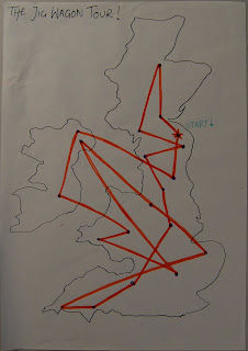
After completing our mood board we discussed possible launch ideas and we decided, as this channel was aimed at an older audience, we shouldn't really be launching it via internet pages, email ads etc as alot of older people don't have access to the internet and/or cannot use it.  Therefore we decided to go along the route of promoting our brand on the streets.  Our 'Jig Wagon' would tour the country visiting all of the major cities.  There they would set a barn dance (HOE DOWN!!!!) and bar saloon, and give away free promotional drinks, Jerky, Chilli & Rice and Gumbo.  There would also be a BYOB (bring your own beef) BBQ.  During this time Peter Chadwick came and spoke to us about our idea and gave us feedback.  Overall I found him attentive, insightful and provided a great deal of constructive criticism.


The day ended with a presentation of all of our work.  


Before attending this Industry Day, I was rather concerned about the fact that I would be working with people that I didn’t know.  However, I feel that I was put into a really good group who were all keen and eager to have some fun and they all got on really well together.
Overall, I would say that the day was big success and that I have learned alot about working at a fast pace and about my ability to work well with a group of people that I have never even met before.  I believe that the National Diploma students learnt and benefitted from being with students who are further on in education and that the Foundation Degree students 
I really enjoyed the day and would love to participate in such events more often.  I hope that Peter Chadwick found his time in college as pleasurable as I did.   


Speaking from experience
These are a few tips that Peter Chadwick gave...
-Communication is very important; you must be
able to communicate without pictures
-Always keep files in the correct places otherwise you lose
them when you export to pdf and other formats
-When presenting, pretend there is a person sitting
right at the back of the room.  Look at them and 
concentrate on them whilst talking if you are
finding it abit scary presenting to a group
-Work hard, keep confident and you will do well
-Always quote double than what you expect, it is a 
job and they want your services so always try and 
get that extra bit of money- don't undersell yourself!


Monday, 18 January 2010

Narc Crit With National Diploma


From this mornings crit, I was advised and decided to use this string and paint splatter as one of my final Narc magazine ideas.  I think that this will work well as the cover of the mag and the cd would be one aspect of it which, when the cd is removed, would leave the same print on the cover as was on the cd sleeve.  I achieved this splatter by dipping string into ink and dropping it onto my paper from a height.  In my opinion the pattern that was left shows a sense of energy and presence.  I took these photos when the paint was still wet and quickly put some typer over it on illustrator just to demonstrate what I am trying to achieve however for my development I will now look into working the type more into the actual piece.  Next I will also scan the dried version into the computer to work on, however this will have a slightly different look and feel as the paint dried darker and the string texture may possibly be more visible.

Sunday, 17 January 2010

Monsters- Water Colour and Ink


These are my water colour and ink versions of my monsters.  I think that they have a more personal feel when they have been done by hand than when produced on a computer.  I like the uneven texture that water colours leave, creating a new, original monster everytime.

Thursday, 14 January 2010

Leeds Advertisement- Shape Your Soul


This is an advert for a car that i came across on a recent visit to Leeds.  The designers had gone for a more ''urban'' or ''street'' feel probably to attract a more younger audience and actually spray painted the advert directly onto the wall.  The advert is for the Kia Soul car.  I think one of the reasons why this advert works so well is it obviously is not standard advert dimentions, they have worked to the dimensions of the space rather than making a standard size advert; this plays on the word 'shape' in 'shape your soul.'


The fact that you dont expect to see this mass of pink paint on the side of a building makes it stand out very well and when you walk along the street is is right in front of you as you walk straight towards it.  I like the fact that the advert doesn't tell you the brand or make of the car, it just has a website address at the bottom.  I think this is so the car is not judged on the brand but rather they are trying to let it speak for its self.  Additionally this is a great way of generating interest as people will go to the site after wondering what it is all about.  This certainly worked on me, curiosity got the better of me and i found myself looking it up online where i discovered photos of other places around the country where they have created such art work in spaces of varying shapes and sizes.

Tuesday, 5 January 2010

Vector Monsters- Negotiated Project


These are some of the illustrations i have been working on to possibly use in my book.  I am wanting to achieve a friendly looking monster as i would like to try and get children to shed their monster fears and see that they are nothing to be scared of.  The story i have currently written tries to teach children to be nice to others and how others will be nice to you.
I have tried to use some textures on the monsters as i would really like my final piece to be mixed media.